Case Study | Financial Enterprise Solutions

J.P. Morgan Chase - Comparison Shopping for Credit Card Products
Senior UX Designer | JP Morgan Chase - Shopping Hub | Enterprise Business Software | Figma, FigJam
My role:
Lead UX Designer on a team of 3 designers, 5 developers, 1 product manager and 1 product manager
Co-led workshop with PM to gain alignment amongst team.
Participated in customer calls to gain clear understanding of their needs
Created designs and interactive prototypes using Figma and the Chase Corporate Branded Material Design System
Developed design language for identifying each environment throughout the product UI
Perform usability/heuristic evaluations on customer applications
Conduct A/B testing and reporting results to senior management and cross-functional teams.
Techniques used:
Design thinking workshop and virtual collaboration with cross-functional team and stakeholders utilizing Figma, FigJam and Teams
UI components sourced from Chase Design System
Wireframing concepts
Prototyping interactions
Advanced customer centricity and design thinking by uncovering opportunities
Defining problems, and creating actionable CX Journeys
Ensure brand, ADA, marketing, and design system standards are upheld and influenced through customer needs
Problem to solve:
Customers are having to hunt for credit cards and offers. They often struggle to compare these cards and understand which card best meets their specific needs. The challenge is to design a comparison flow that simplifies the process, clarifies key differences, and ultimately guides users to make the best choice.
Solution:
A hybrid team design sprint to identify, design and size thigh-impact and high-value new or evolved placement for offers to ensure customer centricity is maintained when business priorities depreciate the experience.
Impact:
A shared experience vision with 30+ impact-oriented design concepts and shortlisted backlog of improved offers across the web and mobile experiences.
Productivity Tools:
Figma > Wireframes & Prototypes
Mural & Figjam > Whiteboarding and collaboration
Qualtrics > Quantitative Research > Competitors Site Analytics
·Documentation > Roadmaps > Use Cases > Benchmarking
Lucid > Diagram > Personas

Impact:
Led modernization and redesign of secure Credit Card shopping experience resulting in 60k incremental accounts and 5+ experiments.
From 2022 drove incremental 120k+ in-year accounts and 420k annual accounts through design strategy, discovery, and delivery of 40+ CB/Card specific experiments in mobile app and secure web.
JP Morgan Chase - Comparison feature and user flow redesign
Understanding the Problem Space: Who are our customers? What do they want? Why are they frustrated?

Linda Green
40-year-old mom of 3, focused on maximizing family travel rewards.
Tech-savvy Chase customer seeking low-fee, high-perk travel cards.
Needs a clear, personalized way to compare credit card options.
Problem Statement
Linda finds credit card comparisons overwhelming and not family-focused. She needs a simple, tailored tool to identify the best travel rewards card for her lifestyle.


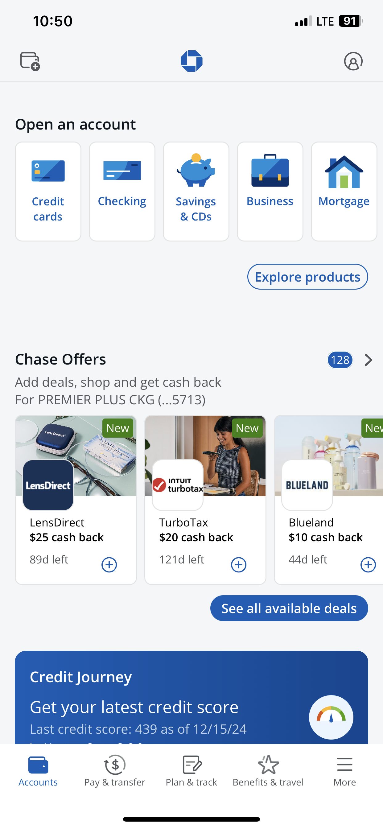
Research, Competitors and Analytics: Measuring user interactive models and placement
Our next step involved further research to create and demonstrate potential solutions. Our methods involved competitive research through the study of comparison tools in various platforms—e-Commerce and other banks—and user interviews. We also took advantage of existing user research concerning comparison tools. This research noted how users interact with the information presented in tables, both on mobile and desktop formats.
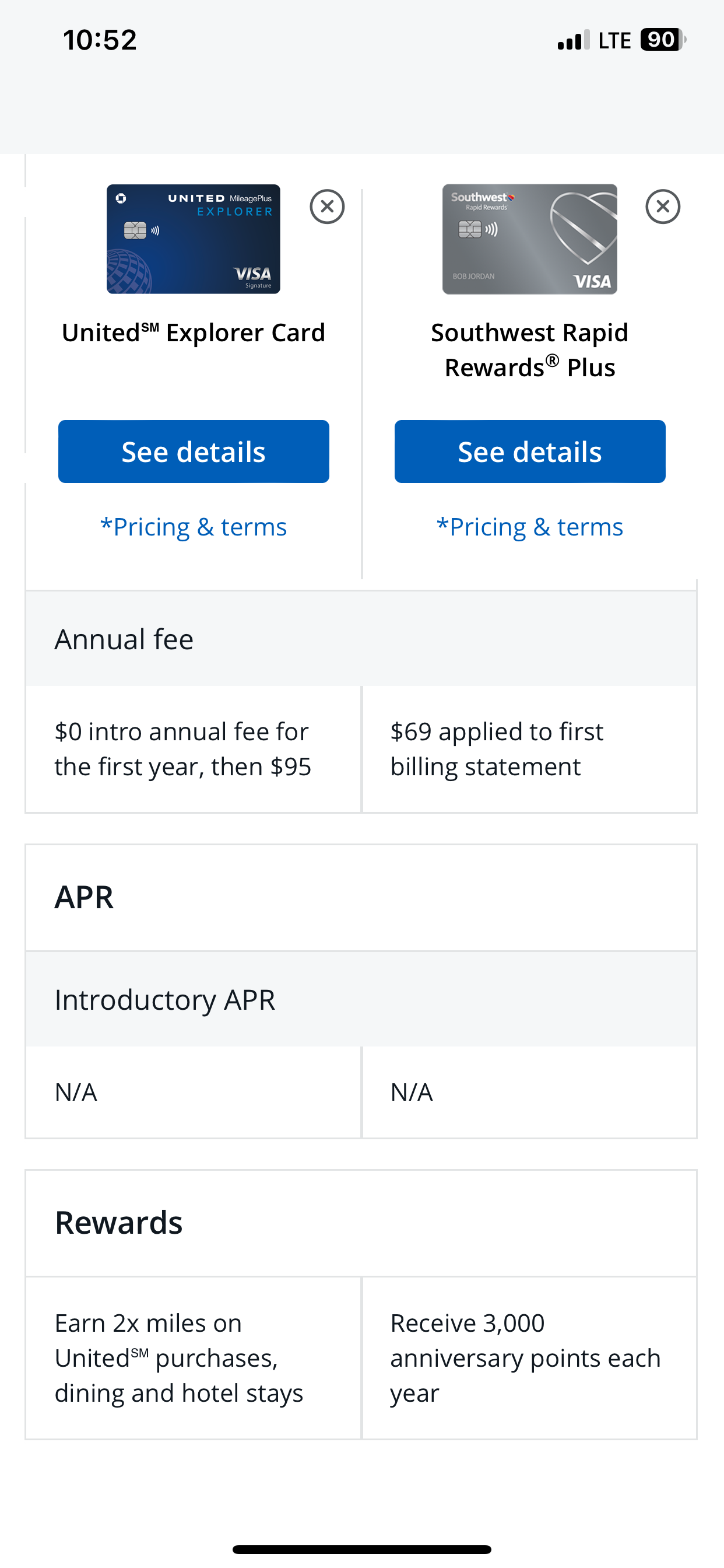
What we learned: We discovered that to create a great comparison tool the key is to demonstrate at least two products side-by-side. Based on our research, we concluded that there is no benefit in showing more than 3 or 4 products at one time—since if one needs to focus on more than 4 items, the task of retaining all pertinent information can become challenging. Therefore, there is higher risk of making the wrong selection.
UX Challenge
Another interesting discovery involved our user types. We learned that we can divide our users into two groups—represented by 'A' and 'B.' Users from group A are detailed-oriented—their decision making process involves researching their options fully before making a decision. They don't mind consuming lots of information in order to find their answer. This group also enjoys employing help of technology during their research. Users from group B are more likely to be overwhelmed by a plethora of options. They have an idea of what they want and seek options that are related to their preconception. They don't like to spend time on details; aiming to pick an option as fast as possible.
UX Solution
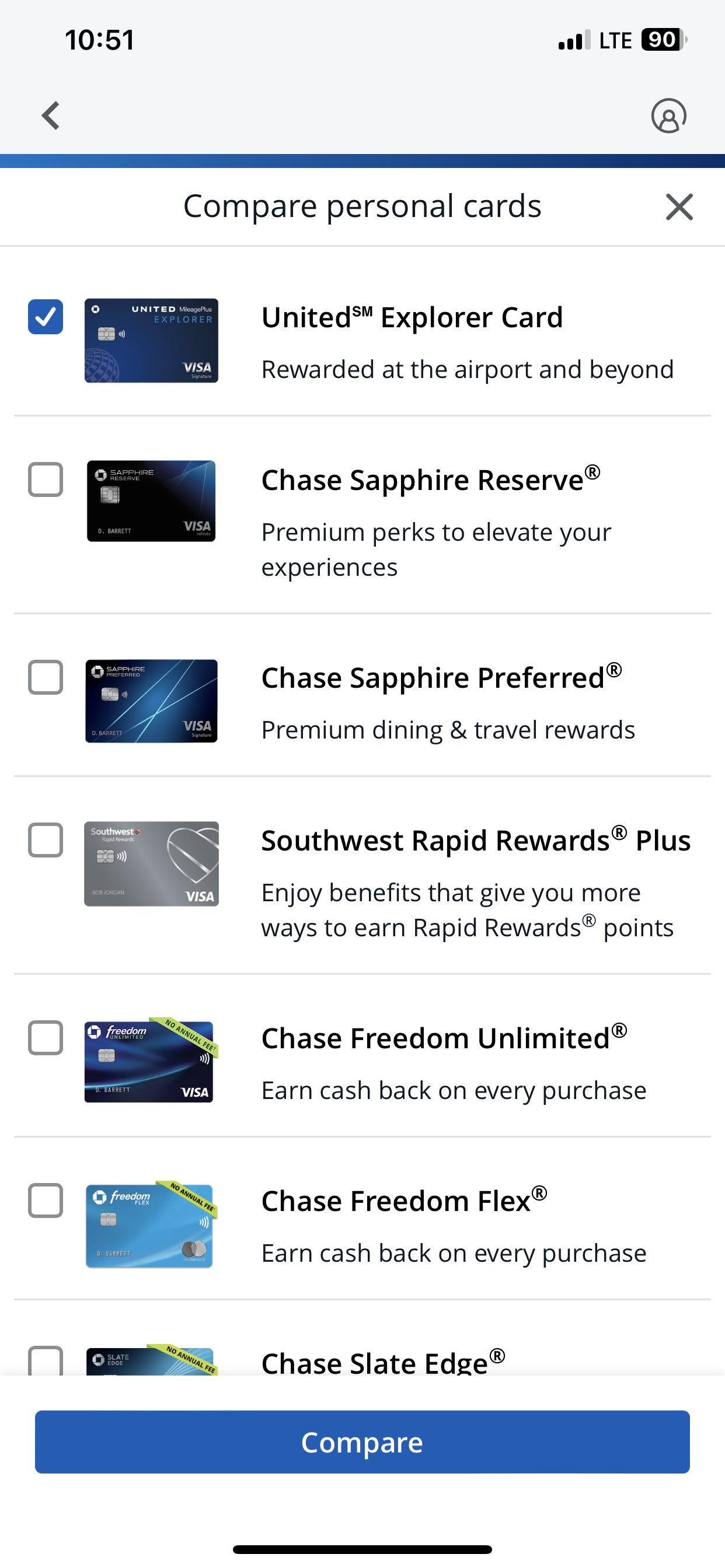
After getting to know our users, we came up with two solutions for each group in order to help them in their decision-making process. We used Credit Card Comparison Tool for group A–so they can see all the possible options and compare them. Credit Card Selector was employed for group B—wherein we narrow down their options by asking them few questions to understand what are they looking for, and presenting only the relevant options to them.
Research & Insights
Maximize rewards: Users want to earn the most points or miles for their spending.
Understand perks: Key travel benefits such as airport lounge access, no foreign transaction fees, travel insurance, etc., are essential.
Minimize fees: Users are often price-conscious and want a card that offers high value without excessive fees.
Easy application: The process of applying for a card should be straightforward and quick.

Design Phase: Wireframes, Design & Prototyping
Once we came up with a higher level solution—in this case two answers—we started to work on the details of these application to bring them into fruition.
1. Personalization
Tailoring offers and ads based on user account preferences, user habits, and demographics increases relevance and engagement.
2. Ad-Free Upgrade Options
Offering tiered personalized promotions where users can opt for ad-free experiences or limited ads gives users flexibility and control.
3. Seamless Integration
Ads and Offers that blend naturally into the content, such as product placements or sponsored recommendations, feel less intrusive.
4. Reward-Based Ads placement
Offering incentives for user ads, such as discounts, or extended user privileges, motivates users to engage voluntarily.
5. Clear Call-to-Action (CTA)
Offers with clear, actionable CTAs (e.g., "Click here for more" or "Scan to learn more") make it easy for users to interact with offers.
6. Enhanced Ad Metrics
Providing feedback or visible progress bars for ad completion helps users feel in control.
7. Cross-Device Synchronization
Allowing users to interact with ads across devices (e.g., scanning QR codes on their phones) improves accessibility and engagement.


Responsive Web
To create an effective comparison tool, the key is to demonstrate at least two products side-by-side. Based on our research, we concluded that there is no benefit in showing more than 2 or 3 products simultaneously.


Responsive Mobile