Case Study | Financial Enterprise Solutions

J.P. Morgan Chase - Comparison Shopping for Credit Card Products
Senior UX Product Design & Interactions
Date: November 2021 - March 2024
Shopping Design Collaboration
From: Customers having to hunt for credit cards and offers
To: A unified backlog that improves customer credit card and offer discovery and benefits the business by increasing ways to server customers.
We wanted/needed to: Make it easier for customers to discover and activate offers in web and mobile without needing to click through multiple screens
We did: A hybrid team design sprint to identify, design and size thigh-impact and high-value new or evolved placement for offers to ensure customer centricity is maintained when business priorities depreciate the experience.
Resulting In: A shared experience vision with 30+ impact-oriented design concepts and shortlisted backlog of improved offers across the web and mobile experiences.
Overview
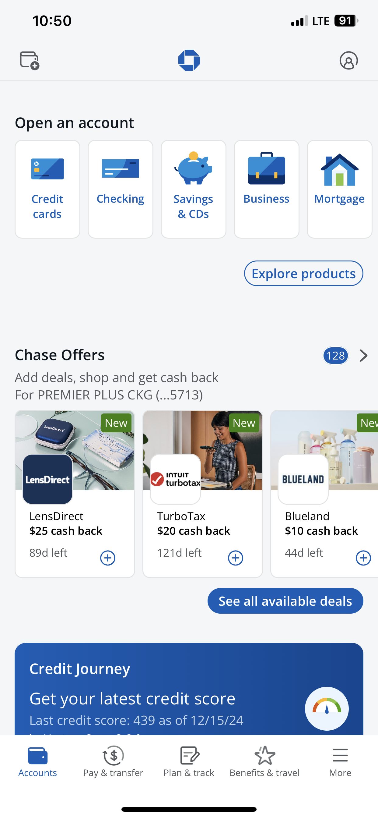
Chase offers a range of travel rewards credit cards, each with unique features like sign-up bonuses, earning potential, and additional travel-related perks.
In this case study, we examined the design and user experience of a Chase credit card comparison flow specifically focused on travel rewards credit cards. The goal was to create a seamless, informative, and intuitive experience that helps users compare various travel rewards cards and select the best one based on their unique preferences.
Challenge
Customers often struggle to compare these cards and understand which card best meets their specific needs. The challenge is to design a comparison flow that simplifies the process, clarifies key differences, and ultimately guides users to make the best choice.
Pain Points
Overwhelming choices: Users feel overwhelmed by the number of options and struggle to identify which card aligns best with their spending habits.
Complex benefits: Understanding benefits such as point multipliers, travel credits, and annual fees can be difficult without proper context.
Customers don’t have a consistent experience across products and channels.
There are many features users don’t want to see during exploring options for reviewing credit card options. Many features users found frustrating and confusing to interact with.
Hidden fees: Some cards may have hidden charges such as foreign transaction fees or high APRs that users are not initially aware of.
User needs, wants and frustrations
Comparing different card features and understanding the fine print.
The user is stuck with suboptimal cards or no card suited for travel.
Discovering the benefits of travel credit cards.
Overwhelm with options or uncertainty about choosing the right card.
Researching options, gathering advice from others.
Committing to choosing and applying for the card.
Making the final decision on which card suits their travel needs.
Completing the application and getting approved.
Enjoying the benefits and rewards of the card.
Realizing the ongoing value of the card as they use it.
Enjoying long-term rewards and perks from the card.
Confidently using the card and sharing insights with others.

Productivity Tools:
Figma > Wireframes & Prototypes
Mural & Figjam > Whiteboarding and collaboration
Qualtrics > Quantitative Research > Competitors Site Analytics
·Documentation > Roadmaps > Use Cases > Benchmarking
Lucid > Diagram > Personas
User flows and Personas: Who are our customers? What do they want? Why are they frustrated?
After reviewing and documenting available data from call centers, web analytics, and surveys about our users, we worked closely with our PO and BA to identify and categorize the user's pain points. As UX designers, we made it easier for rest of the team to understand, prioritize, and communicate the problems through the utilization of user flows and parsons.
Personas A: Parent with children planning a all-inclusive travel excursion
Travel Card Options
Travel Rewards
Family Travel Packages
Travel Miles
Disney+
Personas B: Single young professional planning a travel adventure
Airline and Hotel rewards
Specialty cards
Cash Back Offers
Frequent Flyer rewards
Personas C: Seeking offers and incentive rewards
Travel Card Options: Platforms offering advanced audience segmentation and targeting can enhance ad relevance, potentially leading to higher conversion rates.
Travel Rewards: The type and timing of ads (e.g., pre-roll, mid-roll) can impact viewer engagement and conversion likelihood.
Cash Back Incentive’s: Services with highly engaged audiences may provide better environments for ad conversions.
Travel Miles: Access to detailed performance metrics allows advertisers to optimize campaigns effectively.


Research, Competitors and Analytics: Measuring user interactive models and placement
Our next step involved further research to create and demonstrate potential solutions. Our methods involved competitive research through the study of comparison tools in various platforms—e-Commerce and other banks—and user interviews. We also took advantage of existing user research concerning comparison tools. This research noted how users interact with the information presented in tables, both on mobile and desktop formats.
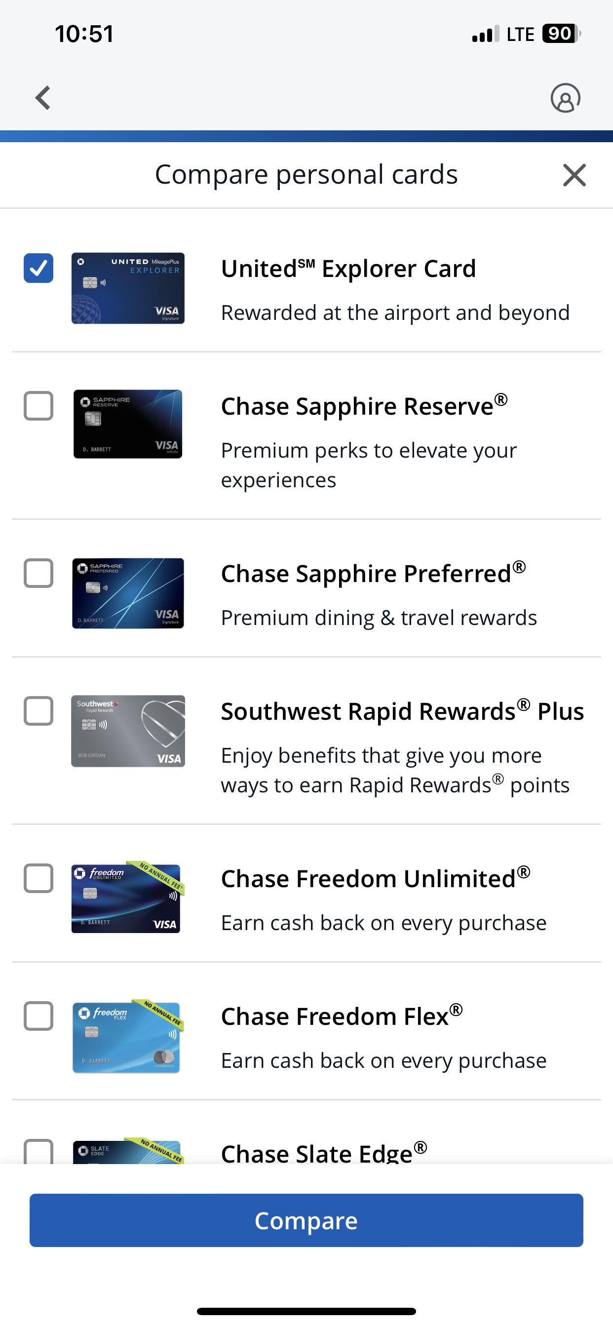
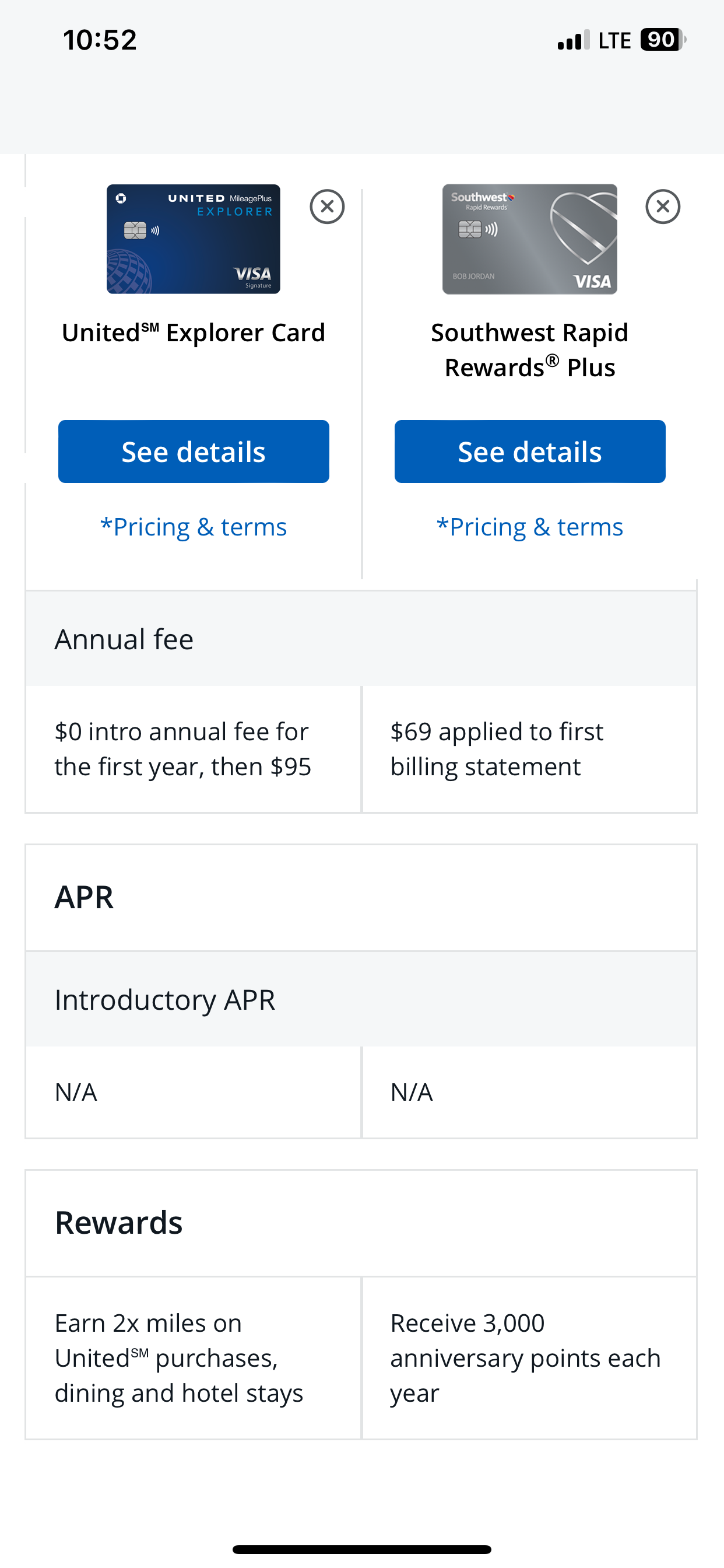
What we learned: We discovered that to create a great comparison tool the key is to demonstrate at least two products side-by-side. Based on our research, we concluded that there is no benefit in showing more than 3 or 4 products at one time—since if one needs to focus on more than 4 items, the task of retaining all pertinent information can become challenging. Therefore, there is higher risk of making the wrong selection.
UX Challenge
Another interesting discovery involved our user types. We learned that we can divide our users into two groups—represented by 'A' and 'B.' Users from group A are detailed-oriented—their decision making process involves researching their options fully before making a decision. They don't mind consuming lots of information in order to find their answer. This group also enjoys employing help of technology during their research. Users from group B are more likely to be overwhelmed by a plethora of options. They have an idea of what they want and seek options that are related to their preconception. They don't like to spend time on details; aiming to pick an option as fast as possible.
UX Solution
After getting to know our users, we came up with two solutions for each group in order to help them in their decision-making process. We used Credit Card Comparison Tool for group A–so they can see all the possible options and compare them. Credit Card Selector was employed for group B—wherein we narrow down their options by asking them few questions to understand what are they looking for, and presenting only the relevant options to them.
Research & Insights
Maximize rewards: Users want to earn the most points or miles for their spending.
Understand perks: Key travel benefits such as airport lounge access, no foreign transaction fees, travel insurance, etc., are essential.
Minimize fees: Users are often price-conscious and want a card that offers high value without excessive fees.
Easy application: The process of applying for a card should be straightforward and quick.

Design Phase: Wireframes, Design & Prototyping
Once we came up with a higher level solution—in this case two answers—we started to work on the details of these application to bring them into fruition.
1. Personalization
Tailoring offers and ads based on user account preferences, user habits, and demographics increases relevance and engagement.
2. Ad-Free Upgrade Options
Offering tiered personalized promotions where users can opt for ad-free experiences or limited ads gives users flexibility and control.
3. Seamless Integration
Ads and Offers that blend naturally into the content, such as product placements or sponsored recommendations, feel less intrusive.
4. Reward-Based Ads placement
Offering incentives for user ads, such as discounts, or extended user privileges, motivates users to engage voluntarily.
5. Clear Call-to-Action (CTA)
Offers with clear, actionable CTAs (e.g., "Click here for more" or "Scan to learn more") make it easy for users to interact with offers.
6. Enhanced Ad Metrics
Providing feedback or visible progress bars for ad completion helps users feel in control.
7. Cross-Device Synchronization
Allowing users to interact with ads across devices (e.g., scanning QR codes on their phones) improves accessibility and engagement.


Responsive Web
To create an effective comparison tool, the key is to demonstrate at least two products side-by-side. Based on our research, we concluded that there is no benefit in showing more than 2 or 3 products simultaneously.


Responsive Mobile