< Back Case Study | Global Risk
Strafor — Global Threat
Product Design Strategy
Project Overview
Client: Stratfor
Industry: Global Intelligence / Publishing
Platform: Web, Mobile, Tablet
Focus: Risk Assessment, Trending Data
My Role
UX Strategy & Experience Design
Interaction Design & Rapid Prototyping
Design Systems & UI Components
Cross-functional collaboration (Product + Engineering)
Documentation (flows, specs, scenarios)
Tools & Deliverables:
Figma > Wireframes & Prototypes
Mural & Figjam > Whiteboarding and collaboration
Qualtrics > Quantitative Research > Competitors Site Analytics
·Documentation > Roadmaps > Use Cases > Benchmarking
Lucid > Diagram > Personas
“Stratfor’s Worldview platform, delivers geopolitical intelligence and risk analysis. The challenge wasn’t just designing a dashboard—it was transforming a content-heavy system into a decision-support platform for global risk.”
Project Goals
Redesign and enhance user profile and customization features
Introduce scalable dashboard architecture
Improve user navigation, filtering, and personalization
Support multi-role users (analysts, researchers, non-technical users)
Enable data-driven workflows for intelligence consumption
Problem Statement
Stratfor’s existing platform lacked:
Flexible user-specific customization
Efficient search and filtering mechanisms
Scalable interaction models across devices
Clear information hierarchy for complex dataset
Solution Summary
Led UX design in collaboration with Senior VP of Product:
Define end-to-end UX workflows
Establish design system foundations
Deliver interactive prototypes and UI libraries
Enable cross-platform consistency (desktop, tablet, mobile)
Support advanced filtering + comparative analysis
“The biggest issue was cognitive overload. Users—primarily analysts and business leaders—were dealing with hundreds of reports, but no clear way to identify what actually mattered.
They had to manually connect events, assess risk, and compare scenarios across regions. That’s a high-friction, high-stakes workflow.”
Process strategy
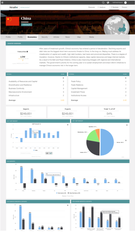
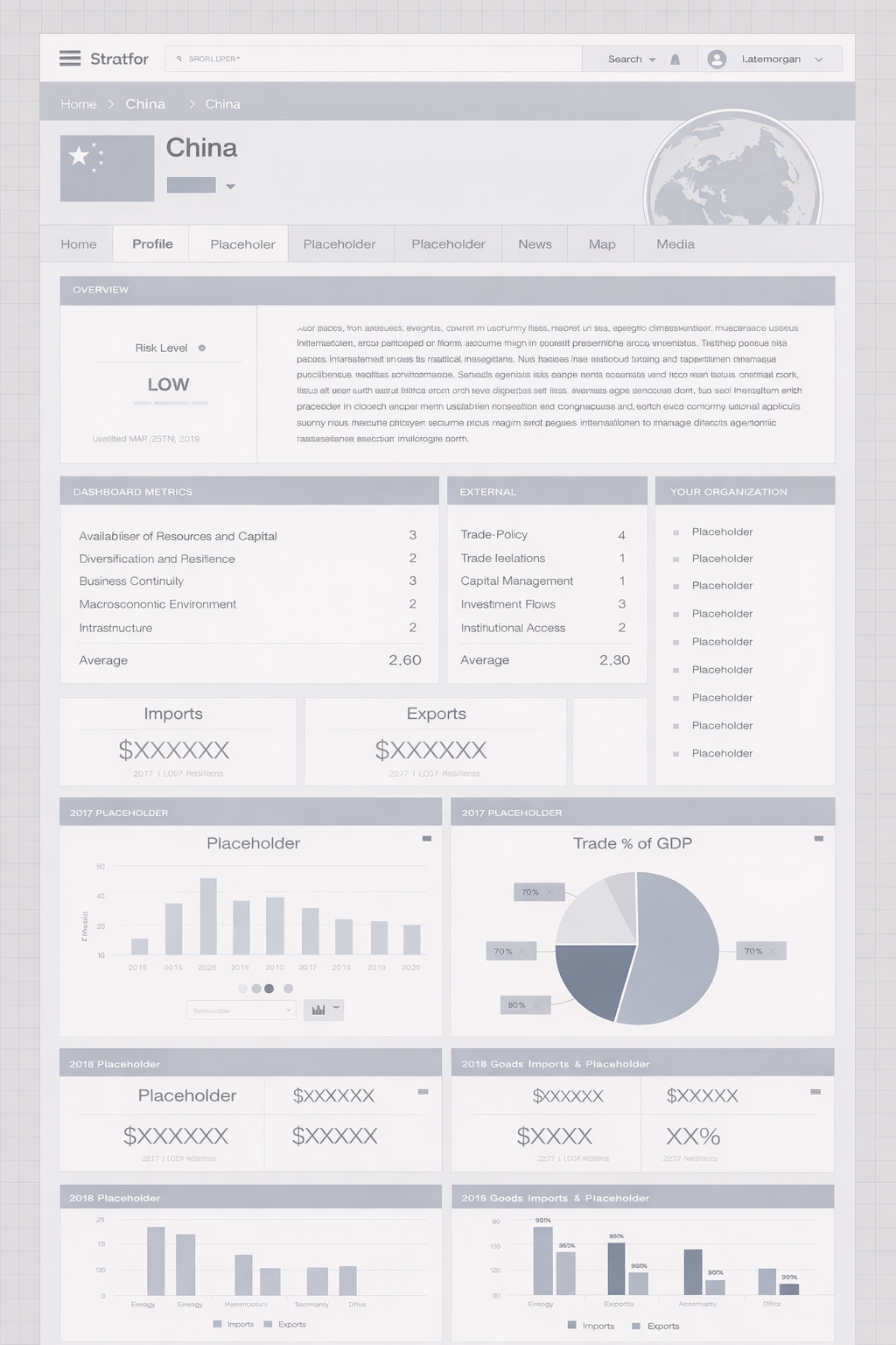
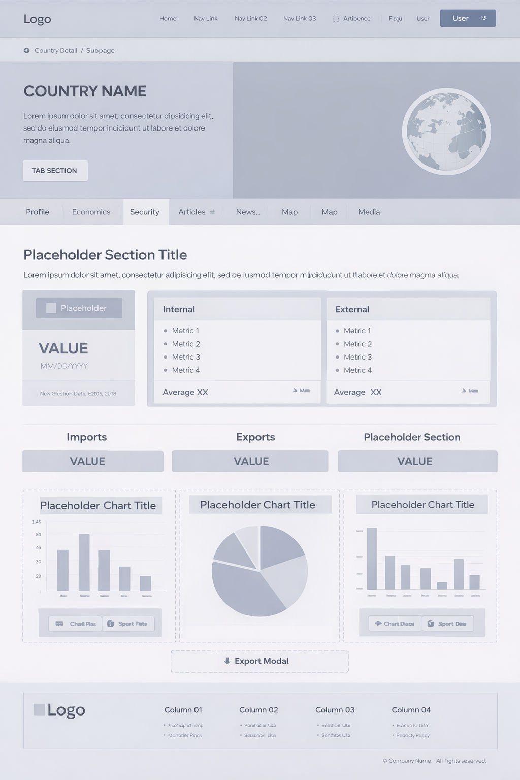
Approached this as a systems design problem by restructuring the information architecture around how analysts think—region, theme, risk type, and time horizon—then designing a Threat Lens dashboard to surface active and emerging risks, introducing advanced filtering and comparison tools to support analysis workflows, and building personalization features so users could track what mattered most.
Key features
Deliver a centralized Threat Lens dashboard for real-time risk visibility, enable multi-dimensional filtering to reduce search friction, provide side-by-side comparison tools to support decision-making, and establish a personal workspace for saving and tracking intelligence.
“The key insight was that this wasn’t a content problem—it was a signal detection problem.
Users didn’t need more information. They needed structured insight and prioritization.”
Big ideas, real impact.
I approached this as a systems design problem by restructuring the information architecture around how analysts think—region, theme, risk type, and time horizon—then designing a Threat Lens dashboard to surface active and emerging risks, introducing advanced filtering and comparison tools to support analysis workflows, and building personalization features so users could track what mattered most.
“This reduced time to insight significantly and increased engagement with key workflows like comparison and saved intelligence.
More importantly, it shifted the platform from passive content consumption to active decision support.”
Product innovation
This work sits at the intersection of UX, data systems, and predictive modeling, focusing on designing for decision-making under uncertainty—a direction increasingly central to AI-driven products.
Evolution
“If I were to evolve this further, I’d integrate AI-driven summarization and predictive risk scoring to move even closer to real-time decision intelligence.”
Journey Mapping
User: Corporate Risk Analyst
Context: Evaluating geopolitical risk using Stratfor Worldview
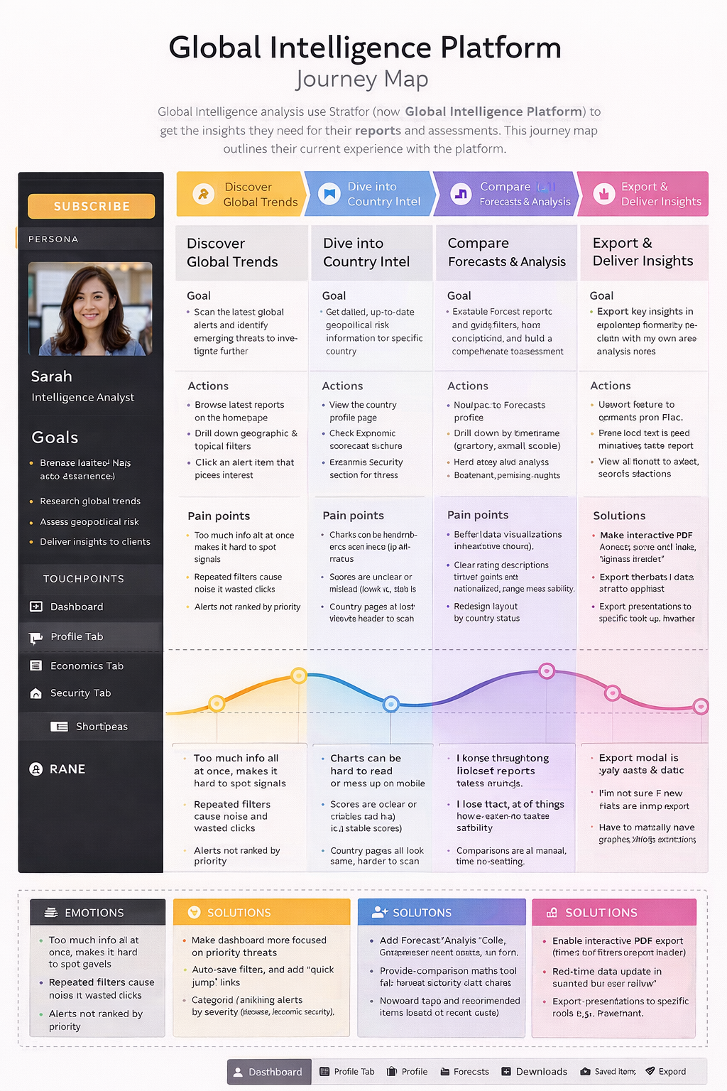
Design Phase:
Wireframes, Design & Prototyping

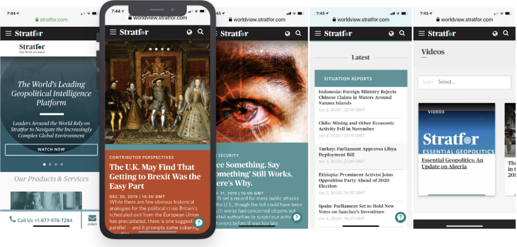
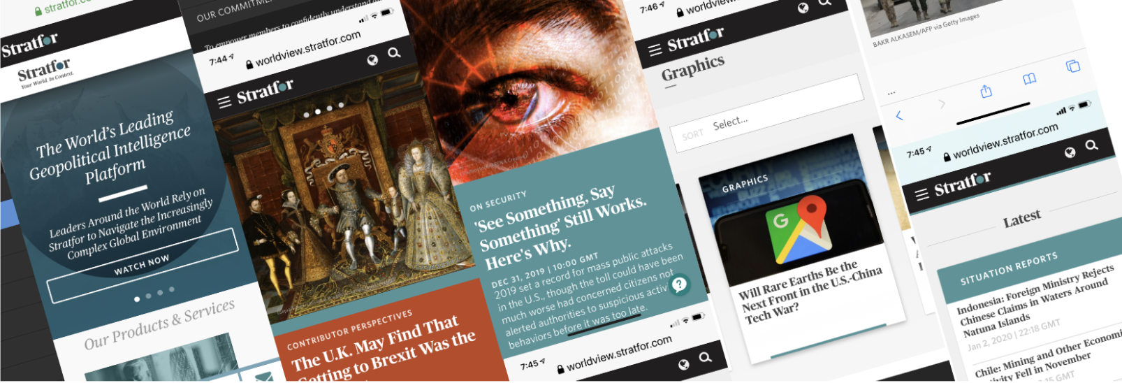
Responsive Web
To create an effective comparison tool, the key is to demonstrate at least two products side-by-side. Based on our research, we concluded that there is no benefit in showing more than 2 or 3 products simultaneously.
Responsive Mobile